Showing posts with label Titles. Show all posts

Sunday, 4 December 2022

Earth Tone Color Variant.

 Testing out new approach using a palette based on the Werner's Nomeclature of Colors study.

These are earth tones compiled in the 1800's based on nature.


Saturday, 20 September 2014

Some Kinetic Typography Fun

I finally got the last director into my "Six Directors" piece. Purely for my own enjoyment and to test out some ideas I present this short movie about movies.


Mostly After Effects, used Lightwave 3D for the Plexus look and some Anime Studio pro for hands and faces in the Lewis segment.

Wednesday, 6 November 2013

I Scream, you scream, we all scream for icecream.

This weird little film was featured on Vimeo, sporting a lolly color palate and wicked sense of humor.


Anytime is ice cream time from Steve Cutts on Vimeo.

It imeadiately reminded me of another earlier confectionary journey into hell by the legendary Kansas studio MK12.


MK12 | Follow the Sun | 2011 from MK12 on Vimeo.

Which brings me to the first thing I ever saw from MK12, because I was searching for a font and MK12 were giving away a free one that they had designed for this...


These will never get old.

Thursday, 24 October 2013

Arrows with Paths and Flaming Text in After Effects

Here is a peek at 2 After Effects tutorials I got in the works. I'm having a small (big) problem editing them so I wanted to get something up in the mean-time.

Ever wanted to know how to make those nice looking arrows that crawl all over maps? I have a cool and versitile solution that will do the job and then some. Plus a tutorial for a flaming text effect that's pretty flaming nice.

Tuesday, 17 September 2013

Walk on the Wild Side (1962)

Best use of a cat in an opening and closing credit sequence, ever. I've been on a bit of a Brook Benton kick of late and that's how I happened upon this classic Saul Bass title sequence. Brook is heard over the closing credits.


I marvel at the execution of the feline stroll sequence, the silky smooth linear moves and even the attitude of the cat who has genuine presence. The video has a minute or so of hold at the tail and nothing happens after the two title sequences, just warning you. I wonder how a modern production would approach this? I doubt it could be bettered.

Saturday, 10 August 2013

The Pixel Painter

Just found this by total accident. it's so inspirational and well made I had to put it up here. Hal Lasko, a retired ex-typographer went digital and started producing amazing pixel art. The credits are also juxtaposed against some of his art and it all looks quite wonderful.


Directed by Josh Bogdan and Ryan Lasko
Photography by Topaz Adizes
Music by Jarod Pedone and Tyler Brown

Friday, 15 February 2013

Micro Empire - Clemens Wirth - Radium Audio

"It’s not at all professional, but the outcome is okay I guess." That's how Clemens Wirth responded when I asked him about the equipment he used in the making of this piece. As will become immediately obvious when watching 'Micro Empire', the outcome is very professional and more than okay. Using tiny animals as the medium, a performance is created, underpinned by a soundscape of biological noise by Radium Audio.


Wirth had done previous work using Macro lenses, but it wasn't enough, he invested in a Monocular Microscope and built an adapter for the Canon 5D markII allowing him to shoot these micro setups.

On this project Wirth used what's known as the "Dark Field" method. Light is focused at the subject, which absorbs and emits it back to the camera. This gives the resulting deep black background and self illuminated high contrast subject.

POSTPRODUCTION

Because the microscope has a very shallow depth of field, some shots were built up with layers to recreate some crisp focus, but this was only possible when the subjects weren't moving much.

Micro Empire was self funded and took a number of months to produce, as long as it took to capture the footage, roughly an equal amount of time was spent with editing and sound design. Sound is a massive component in this piece. You can see more of Wirth's work and his methods here and here

Friday, 8 February 2013

Richard Williams, designer, animator, writer, filmmaker

Richard Williams would be best known for his work on the Pink Panther title animations, he did have the advantage of working with some brilliant composers during his career. I try to highlight pre-digital works when I can, and when we look at the title sequence he put together for the film "What's New Pussycat?" there really isn't anything that digital techniques could improve upon. The hand made element is very evident in this example, it's obvious that we're looking at actual art placed in front of a camera and lit. The timing is wonderful and plenty is achieved with straight cuts (the best special effect).


The final reveal to the first frame of the movie is like the opening of a story book. This title animation preceded the one he would do for "Casino Royal". Both films starred Peter Sellers and were scored by Burt Bacharach.

Casino Royal Titles - Original

The film is pretty cool up until Peter Sellers is killed off, and then we're left with an expensive star studded romp with no center. But the titles, I always loved the titles. All that animated pop art livery that embellishes the text with tinted process shots inserted into their bowls, playing perfectly with a killer arrangement by Burt Bacharach, this has ensured I always see little animated trumpets when I hear a good horn section.


Peter Sellers bought into the movie thinking he was really playing Bond, and if they had made that movie it would have been fantastic, because I totally buy Sellers take on Bond. However that movie might not have had these titles.

Title and Montage effect by Richard Williams.

Monday, 28 January 2013

Pre-digital, or why limits are a good thing.

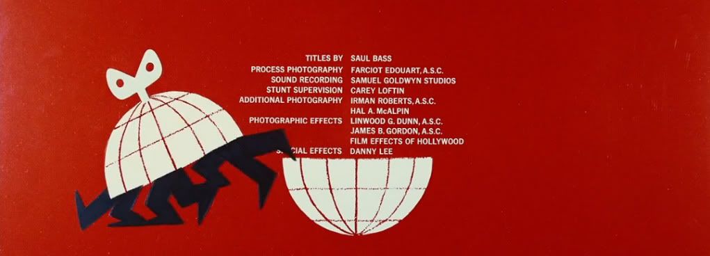
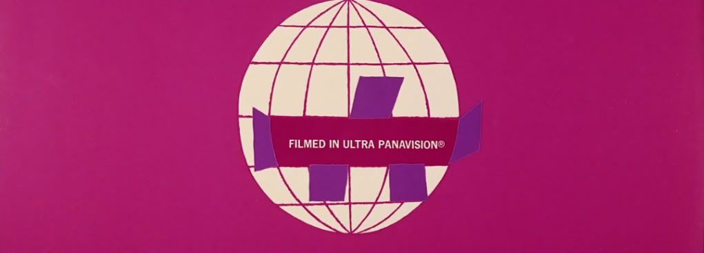
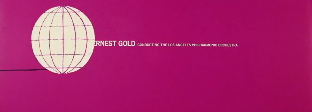
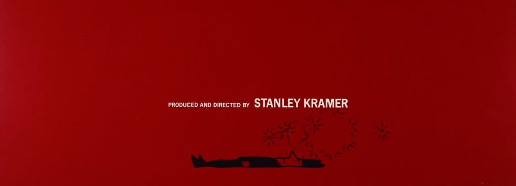
The year is 1963, your sitting in a movie theatre waiting for the main feature to start, the film is a comedy that everyone's been talking about. The curtains lift and the screen illuminates. Before you Saul Bass's block of solid color occupies a wide expanse in "Ultra Panovision". The orchestral circus score by Ernest Gold is doing a lot of the work and after it all starts to have its effect the titles kick in. Up on the big screen are crude, sharp, keenly drawn cartoon scribbles, and they're making you laugh. Welcome to the title sequence of Stanley Kramers "It's a Mad Mad Mad Mad World".


Watch it here at...
http://www.artofthetitle.com/title/its-a-mad-mad-mad-mad-world/


Many pre-digital works are better conceived and executed than today's more technologically fluid work. Making visuals with real world materials meant the idea behind the vision was stripped of unnecessary and difficult to do fluff, making the end result clear and strong.

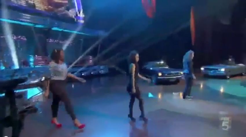
 It's akin to how a very simple set of painted flats filmed with two locked down cameras somehow looks more together visually than the million dollar staging of event shows like IDOL. Typically today's sets are a dazzling jumbo-tron multi spot lit combo crowning the show's logo, the camera's swoop and glide where they please, all up in the performers space taking in everything from warped angles. The end result has nothing to do with the artist and everything to do with branding a performance to a franchise.  

 60's STRONG

But what's going on here?


 Performers become iconic against pure backdrops and crisp art direction, they are lost among noisy clutter and a wealth of camera positions. This applies to an idea, how it can drown in a soup of cleverness, or be over shadowed by the slick trickery of presentation. With less and less limitations on our creativity, we should start setting our own, if only to clarify what it is we are trying to say.